Projects
See how your project is performing compared to all company projects.
Overview
On the Projects tab is presented the total number of company projects. In this case it is 61.
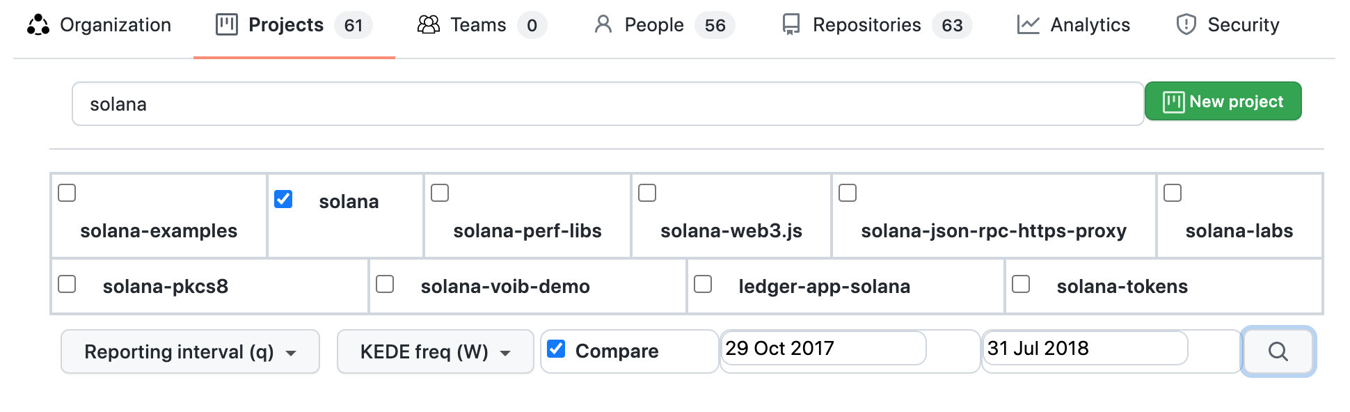
Below it is the search box for projects. You can search for your company's projects by long name. Search looks into your company's projects by long name, not project IDs (project name) and returns up to 10 results. Initially are listed the 10 company's projects most active in the last 30 days before the latest commit date for the company.
Also a new project can be created by clicking the "New project" button.
Report parameters that can be selected are:
- Reporting interval - can be daily, weekly, monthly or quarterly.
- KEDE frequency - could be daily or weekly.
- Compare - Switch on/off comparability with the rest of the world.
- Verbose - Switch on/off showing the individual data points.
- Start and end dates of the report.
Project Capability Over Time
Process capability is defined as a statistical measure of the inherent process variability of Knowledge Discovery Efficiency (KEDE), which quantifies the balance between individual capability and work complexity.
Weekly KEDE for a project is calculated as follows:
- Take all developers who contributed code to any of the project's repositories during a selected time period.
- For each developer, their Weekly KEDE is computed by aggregating KEDE values over all repositories they contributed to during that week. For instance, if developer A contributed to repositories R1 and R2 during a week, and the Weekly KEDE values for R1 and R2 were 2 and 3 respectively, then the developer's Weekly KEDE for that project and week would be 5.
KEDEHub provides insights into project capability over time, allowing organizations to monitor and identify trends in their performance. The diagram below presents a time series of Weekly KEDE values for a selected project over a given period. On the x-axis, the diagram displays the week dates, while on the y-axis, it shows the Weekly KEDE values.
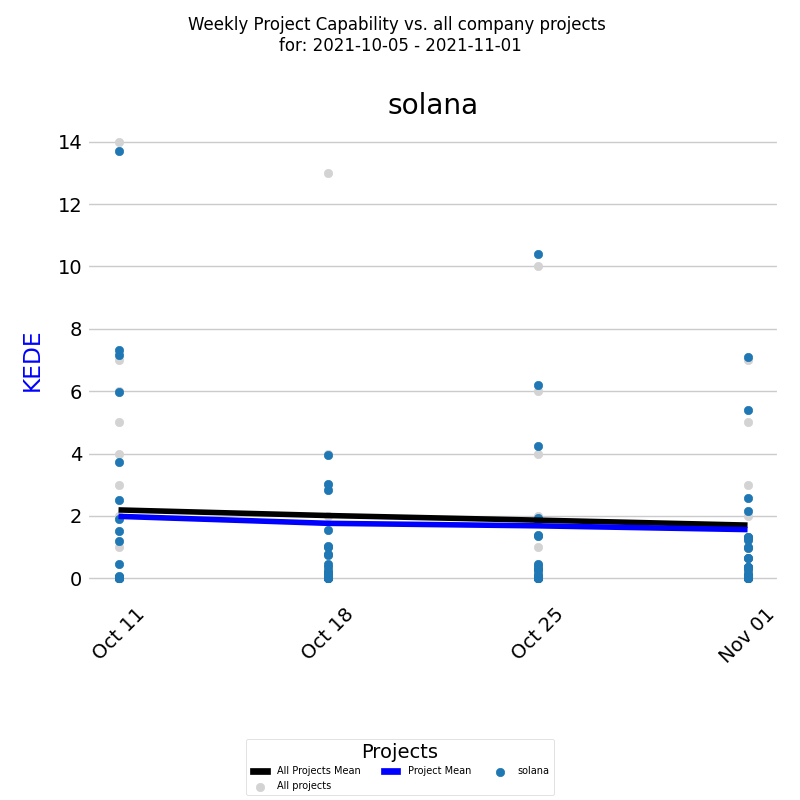
Each colored dot represents an individual developer's Weekly KEDE, and the dark blue line represents the average weekly KEDE for all developers calculated by EWMA.
To gain a deeper understanding of the organization's project capability, it's important to compare it with the capability of all other projects. The same diagram displays the Weekly KEDE of all developers who contributed to other company projects during the selected time period, with each such individual developer's Weekly KEDE presented as a light gray dot, and the black line representing the average weekly KEDE for those developers calculated by EWMA.
This report can be generated for Daily KEDE as well. Additionally, the same report can be run for multiple projects, allowing organizations to compare and analyze their project capability across various initiatives.
Distribution of Project Capability
Process capability is defined as a statistical measure of the inherent process variability of Knowledge Discovery Efficiency (KEDE), which quantifies the balance between individual capability and work complexity.
In addition to tracking a project's capability over time, it is also useful to examine the underlying frequency distribution of its capability values. A frequency distribution provides insights into the distribution of the capability values and how often each value occurs.
The diagram below displays a histogram of weekly averaged KEDE values for a selected period, with the x-axis representing the Weekly KEDE and the y-axis showing the percentage of each particular value.
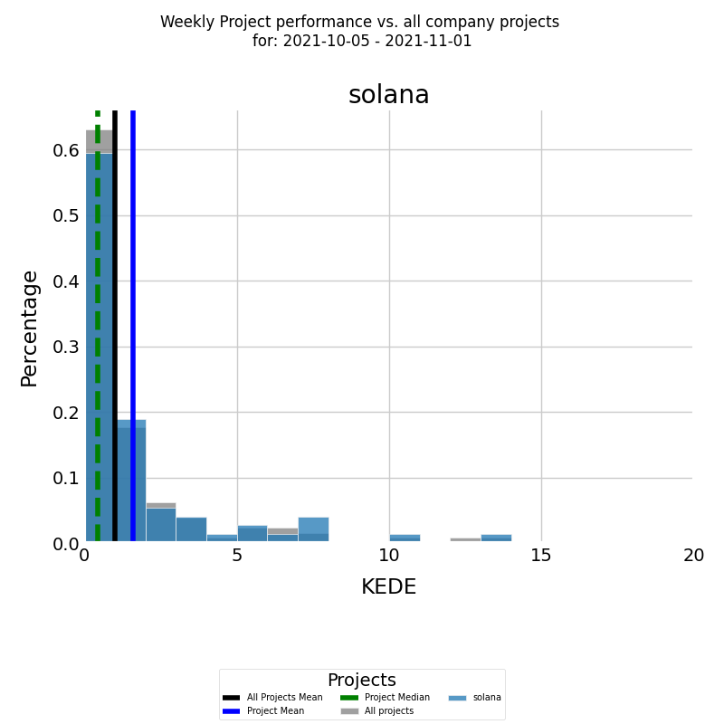
The histogram is presented in color for the selected project, with the blue vertical line representing the average weekly KEDE for the project for the selected period, calculated using arithmetic mean. The median Weekly KEDE for the project for the selected period is presented by the green vertical dashed line.
To gain a better understanding of the project's capability levels, it's important to compare them with those of other projects in the company. The same diagram presents the Weekly KEDE frequency of all other company developers who contributed to all other projects during the selected time period, with the histogram presented in gray. The black vertical line represents the average weekly KEDE of all other developers calculated by arithmetic mean.
The same report can also be run for Daly KEDE and for multiple projects.
Comparing Project Capability with Company Average
Process capability is defined as a statistical measure of the inherent process variability of Knowledge Discovery Efficiency (KEDE), which quantifies the balance between individual capability and work complexity.
In order to analyze the capability of projects over time, you can use the diagram presented below.
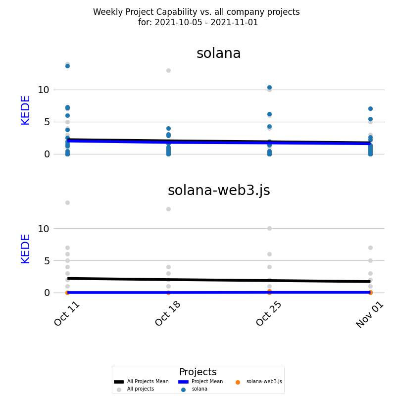
It shows a time series of Weekly KEDE values for two projects, compared to the capability of all projects in the company during a selected period. Each project's average capability is presented by the dark blue line, while the black line represents the average weekly KEDE for the company. By examining the diagram, it's evident that the first project's average capability is similar to the company average, while the second team's average capability is consistently lower than the company average for most of the selected period.
In addition to the time series, it's useful to analyze the underlying frequency distributions of the projects' capability. The diagram below presents histograms of weekly averaged KEDE values for the same two projects, with each project's average capability presented by the blue vertical line.
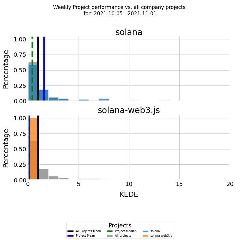
By comparing the histograms, we can see that the average capability of the first project is higher than the company average capability. In contrast, the average capability of the second project is less than the company average, indicating that it may require additional attention and resources to improve its performance.
It's important to note that the same report can be generated for Daily KEDE, providing a more granular view of project performance over time.
Resource Allocation
Resource allocation involves assigning available resources to projects in the most effective way. Resources can include people, equipment, finances, and time.
In software development, knowledge is considered the primary resource. This knowledge is embodied in people. It is referred to as "developer's capabilities," which encompass the comprehensive set of skills, experience, and theoretical knowledge that a developer possesses. These capabilities include their ability to understand complex problems, utilize technical skills, and apply their knowledge practically to create effective software solutions.
This resource is allocated when it is applied to produce tangible outputs, such as working software.
The emphasis is on how this resource is distributed to ensure that every aspect of the project is covered efficiently, and the resource is utilized without waste. For developers, this involves determining who works on what tasks and how much of their capability is dedicated to various activities. It’s about matching the available resources to the demands of all projects effectively.
Resource Allocation Measurement
To effectively measure this allocation of knowledge, we use the Knowledge Discovery Efficiency (KEDE) metric. KEDE values range from 0 to 100, representing the extent of a developer's knowledge application:
- A KEDE value of 0 indicates no allocation of the developer's capabilities—meaning the developer's knowledge is not being applied to the project at that time.
- A KEDE value of 100 signifies full allocation, where the developer's capabilities are fully utilized in applying knowledge to project tasks.
This metric helps in assessing how effectively the knowledge and skills of software developers are being utilized in the development process, ensuring that projects are staffed optimally and that each developer's talents are used efficiently.
The resource allocation diagram below answers the question: "How are different developers (each with their unique skills and expertise) allocated over time to a specific project over a specified time period?"
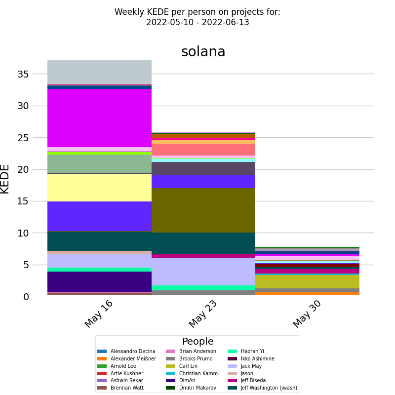
On the x-axis, we have the week dates, and on the y-axis, we have the weekly KEDE values. The chart displays a series of stacked bars, with each bar representing the capability for the selected project. Each bar is divided into segments, with each segment corresponding to the fraction of capability contributed by a specific software developer. The legend lists all the developers who contributed to the selected project, and the colors in each bar indicate which developer made each contribution.
By using this chart, it is possible to identify which developers had the greatest allocation to the project during any given week or over the entire period. This information can help organizations to optimize their development teams and assign tasks more effectively. Ensuring that the project progresses efficiently without overloading any single team member is crucial for effective project management and planning, ultimately improving project outcomes.
This report can also be generated for Daily KEDE and for multiple projects, allowing for even deeper analysis of resource allocation.
Project Predictability
Project Predictability answers the question, “Are we going to deliver this project on time?”
Predictability is a key aspect of project management, as it allows organizations to plan and allocate resources effectively. By analyzing the predictability of a project, organizations can identify potential risks and take proactive measures to mitigate them.
The primary resource in software development is knowledge, which acts as the fuel that drives the software development engine. The true nature of software development is a progression from some knowledge about an idea to full comprehension of a finished product ready for delivery. Essentially, software development is a process of knowledge accumulation.
We measure the predictability of a software development project as its ability to meet its expected knowledge discovery rate within a set timeframe.
The learning curve shows the rate of knowledge accumulation about "what to do" and "how to do it" in order to deliver working software. By comparing the rate of knowledge acquisition of the current project with that of the forecasted learning curve, we can gauge how closely the process aligns with our expectations
The learning curve serves as a leading indicator for project predictability by measuring the rate of knowledge acquisition, enabling proactive management of potential issues and alignment with project expectations.
Predictability Index indicates how much a project's learning curve is aligned with the forecasted learning curve.
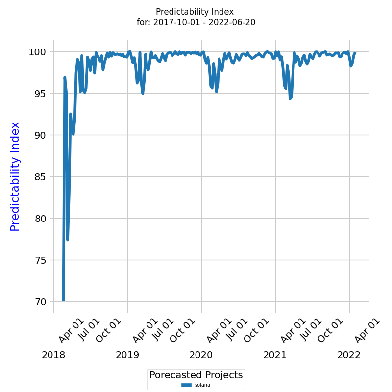
On the x-axis we have weekly dates from the start of a project, while on the y-axis we have the predictability index for each week. The predictability index ranges from 0 to 100. A predictability index of 100 indicates that the new project is perfectly aligned with the forecast, while a predictability index of 0 suggests that the new project is significantly diverging from the forecast. By monitoring the predictability index over time, project managers can identify early signs of potential issues and take corrective actions to realign the project with the forecasted learning trajectory.
The diagram shows the probability index for a project is much less than 100 in the beginning. This indicates that the project was not aligning with the forecast as expected. We can say the project was unpredictable and required immediate attention to realign it with the forecasted learning trajectory.
Impact of Project Size on its Capability
Process capability is defined as a statistical measure of the inherent process variability of Knowledge Discovery Efficiency (KEDE), which quantifies the balance between individual capability and work complexity.
The size of a software development project can have a significant impact on its capability, as larger teams may face greater challenges in collaboration and coordination. To better understand this relationship, KEDEHub provides two diagrams for analysis.
The first diagram is a time-series chart that shows how project capability is affected by project size over time.
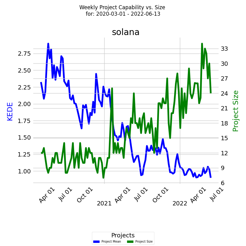
The x-axis displays the week dates, while the two y-axes represent the capability and size of the project. The capability axis, located on the left, is measured in Weekly KEDE values and is represented by a dark blue line calculated using the Exponentially Weighted Moving Average (EWMA) method. Each point on the blue line represents the average Weekly KEDE for all developers who contributed in that week. On the right, the project size axis is represented by a green line that shows the number of developers who contributed to the project in a given week. How the diagram is constructed is available here.
This chart can provide valuable insights into how project size affects capability, helping organizations better manage their projects, schedules, and costs.
Distribution of Capability vs. Number of Developers
Process capability is defined as a statistical measure of the inherent process variability of Knowledge Discovery Efficiency (KEDE), which quantifies the balance between individual capability and work complexity.
Along with the time series of a project's capability, it's also useful to analyze the underlying frequency distribution. A histogram can display how often each different value in a set of data occurs. The diagram below shows the project size that achieved the highest weekly averaged KEDE values for a selected period.
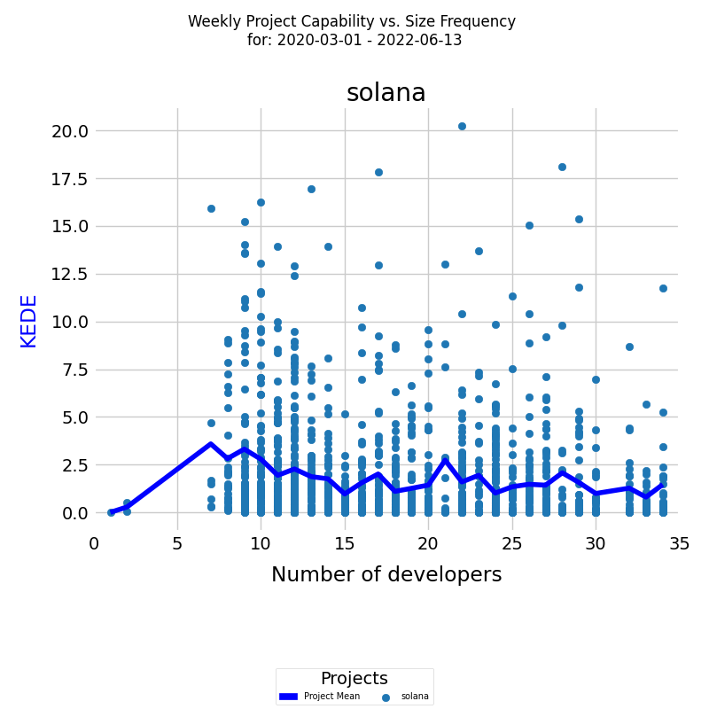
On the x-axis, we have the number of developers who contributed to the project in a given week. On the y-axis, we have the percentage of each particular value. Each individual developer's aggregated weekly capability is represented as a light blue dot on the diagram. The dark blue line is the average weekly capability for all developers, calculated by arithmetic mean. How the diagram is constructed is available here.
This analysis can provide insights into how project size affects the capability of the team and inform project and schedule management decisions.
Project Happiness Over Time
Happiness level for a project is calculated as follows:
- Take all developers who contributed code to any of the project's repositories during a selected time period.
- For each developer, their Happiness level is computed by aggregating Happiness levels values over all repositories they contributed to during that week. For instance, if developer A contributed to repositories R1 and R2 during a week, and the Happiness level values for R1 and R2 were 20 and 30 respectively, then the developer's Happiness level for that project and week would be 50.
KEDEHub provides insights into project average happiness over time, allowing organizations to monitor and identify trends in their performance. The diagram below presents a time series of Happiness levels for a selected project over a given period. On the x-axis, the diagram displays the week dates, while on the y-axis, it shows the Happiness levels.
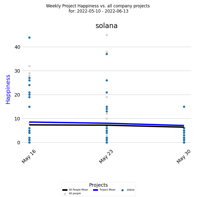
Each colored dot represents an individual developer's Happiness level, and the blue line represents the average Happiness level for all developers calculated by EWMA.
In addition, it's important to compare the project's happiness with the average happiness of the company. This is presented by the Weekly Happiness for all developers who contributed code to any of the company projects during the selected time period. Each individual developer's Weekly Happiness is presented as a light gray dot, and the black line is the average weekly Happiness for those developers calculated by EWMA.
This report can be generated for Daily Happiness as well. Additionally, the same report can be run for multiple projects, allowing organizations to compare and analyze their project Happiness level across various initiatives.
Distribution of Project Happiness
In addition to tracking a project's Happiness level over time, it is also useful to examine the underlying frequency distribution of its Happiness levels. A frequency distribution provides insights into the distribution of the capability values and how often each value occurs.
The diagram below displays a histogram of averaged Happiness levels for a selected period, with the x-axis representing the Happiness level and the y-axis showing the percentage of each particular value.
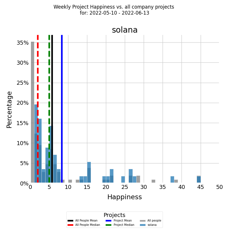
Firstly, we are interested in the project's summarized historical Happiness. That is presented by the histogram in color of the Weekly Happiness frequency of the developers who were assigned to the project for the selected period. The blue vertical line is the average weekly Happiness for the project for the selected period, calculated by arithmetic mean. The median Weekly Happiness for the project for the selected period is presented by the green vertical dashed line.
Secondly, we are interested in the summarized historical Happiness of the company. That is presented by the histogram in gray of the Weekly Happiness frequency of all other company developers who contributed to all other company projects during the selected time period. The black vertical line is the average weekly Happiness of all other developers, calculated by arithmetic mean. The median Weekly Happiness for all other developers is presented by the red vertical dashed line.
This report can also be run for Daily Happiness. Additionally, it's useful to show the Happiness of a project only across selected projects. The logic is the same, only this time we select Weekly Happiness only for the selected projects.
Project Information Loss Rate Over Time
Rework level for a project is calculated as follows:
- Take all developers who contributed code to any of the project's repositories during a selected time period.
- For each developer, their waste level is computed by aggregating waste levels values over all repositories they contributed to during that week. For instance, if developer A contributed to repositories R1 and R2 during a week, and the waste level values for R1 and R2 were 2 and 3 bits lost respectively, then the developer's waste level for that project and week would be 5 bits lost.
KEDEHub provides insights into project average waste over time, allowing organizations to monitor and identify trends in their performance. The diagram below presents a time series of waste levels for a selected project over a given period. On the x-axis, the diagram displays the week dates, while on the y-axis, it shows the waste levels.
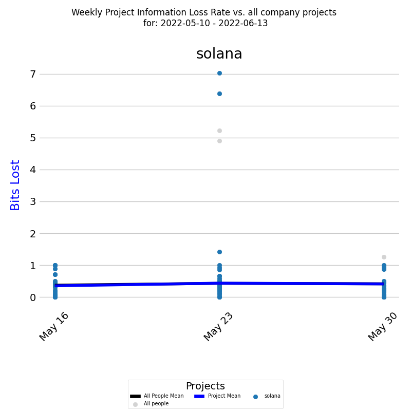
Each colored dot represents an individual developer's waste level, and the dark blue line represents the average waste level for all developers calculated by EWMA.
In addition, it's important to compare the project's waste with the average waste of the company. This is presented by the Weekly waste for all developers who contributed code to any of the company projects during the selected time period. Each individual developer's Weekly waste is presented as a light gray dot, and the black line is the average weekly waste for those developers calculated by EWMA.
This report can be generated for Daily waste as well. Additionally, the same report can be run for multiple projects, allowing organizations to compare and analyze their project waste level across various initiatives.
Distribution of Project Information Loss Rate
In addition to tracking a project's Rework level over time, it is also useful to examine the underlying frequency distribution of its waste levels. A frequency distribution provides insights into the distribution of the capability values and how often each value occurs.
The diagram below displays a histogram of averaged waste levels for a selected period, with the x-axis representing the waste level and the y-axis showing the percentage of each particular value.
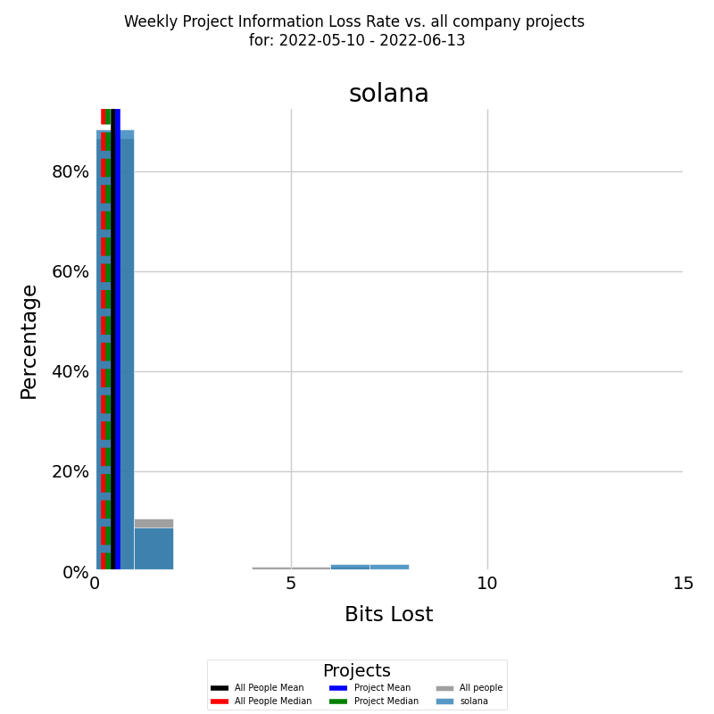
The histogram is presented in color for the selected project, with the blue vertical line representing the average waste level for the project for the selected period, calculated using arithmetic mean. The median waste level for the project for the selected period is presented by the green vertical dashed line.
In addition, it's important to compare the project's waste with the average waste of the company. To do this you need to select 'compare' from the diagram options. This is presented by the waste for all developers who contributed code to any of the company projects during the selected time period. Each individual developer's waste is presented as a light gray dot, and the black line is the average waste for those developers calculated by EWMA. The median Weekly waste for all other developers is presented by the red vertical dashed line. To see the individual dots you need to select 'verbose' from the diagram options.
The same report can also be run for Daly waste and for multiple projects.
Cumulative Growth Rate of Knowledge Discovered per Developer
In the context of our knowledge-centric approach to software development, understanding the individual growth rates of knowledge discovered per developer is an important metric to track the progress of a project. The diagram below shows the exponential cumulative growth rates of each developer who worked on the selected project for a selected period.
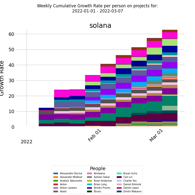
The x-axis represents the week dates, while the y-axis represents the exponential cumulative growth rate. This quantifies the compound growth rate of knowledge discovered over time, taking into account the compounding effect of growth. It serves as a measure of how rapidly the knowledge of each developer is expanding.
The diagram uses a series of stacked bars to represent the exponential cumulative growth rate of knowledge for each developer, week by week. Each developer is depicted in a different color, allowing for clear differentiation between developers. A legend accompanying the diagram identifies the corresponding developer for each color.
Each bar is divided into multiple boxes, and these boxes collectively form a "virtual line" for each developer. Each virtual line corresponds to an individual developer's growth rate. The height of the line signifies the amount of knowledge a developer needed to discover, reflecting the knowledge gap between the required knowledge for project tasks and the knowledge the developer initially possessed.
This report is also available for Daily KEDE and for multiple projects. By running this report on multiple projects, you can compare the cumulative growth rate of developers across different projects and identify patterns and trends that may affect the success of your projects.
Interpretation
The visualization of the Cumulative Growth Rate of Knowledge Discovered in this format offers a valuable perspective on individual and collective learning within the project. By analyzing the individual lines, one can ascertain the rate of knowledge acquisition for each developer. Comparing the virtual lines helps in identifying variations in learning pace and potential areas where knowledge sharing or additional training might be beneficial.
This diagram, therefore, serves as a powerful tool for project managers and team leads, assisting in understanding the learning dynamics of the team and making informed decisions to guide the project's success.
In general an increase in the rate of the cumulative growth of knowledge discovered means a developer is doing something they don't know enough about. Either "what" to be done or "how" to do the "what" or both. If a particular developer has a much fatter band relative to the rest of the team then the case might be:
- she is working on more complex, innovative parts
- her abilities don't match the work challenges, thus she needs training or a new task
- she is having issues sharing knowledge with the rest of the team, the customer or both
- she is dealing with technical debt
- mix of the above
Growth Rates of Languages Used in a Project
In software development projects, it is common to use multiple programming languages. The diagram below provides insight into the growth rates of each language used in the selected project for the selected period.
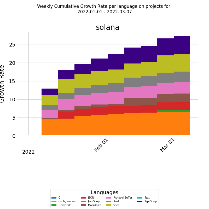
On the x-axis, we have the week dates, and on the y-axis, we have an exponential cumulative growth rate. Each bar represents the exponential cumulative growth rate of a language for the respective week, and the data for each of the languages is stacked so that we can see the total language growth rate for the selected project and time period. This diagram helps to understand how each language used in the project contributes to the overall growth rate.
This report is also available for Daily KEDE and for multiple projects.
Getting started


