Organization
See how your organization is performing
Company Capability Through Time
Process capability is defined as a statistical measure of the inherent process variability of Knowledge Discovery Efficiency (KEDE), which quantifies the balance between individual capability and work complexity.
To understand your organization's historical capability and how it compares to the rest of the industry, KEDEHub provides powerful time series diagrams. By analyzing the aggregated Weekly KEDE values for your company and for all other companies on KEDEHub during the selected time period, organizations can identify any patterns or trends that may be affecting their capability and take steps to improve it.
Weekly KEDE for a company is calculated as follows:
- Take all developers who contributed code to any of the company's projects during a selected time period.
- For each developer Weekly KEDE is aggregated over all projects. For example, if developer A worked on projects P1 and P2 during a week and Weekly KEDE for P1 was 2 and Weekly KEDE for P2 is 3 then the developers's Weekly KEDE would be 5 for that week.
The diagram below presents a time series of aggregated Weekly KEDE values for a whole company for a selected period, with the x-axis representing the week dates and the y-axis displaying the Weekly KEDE values.
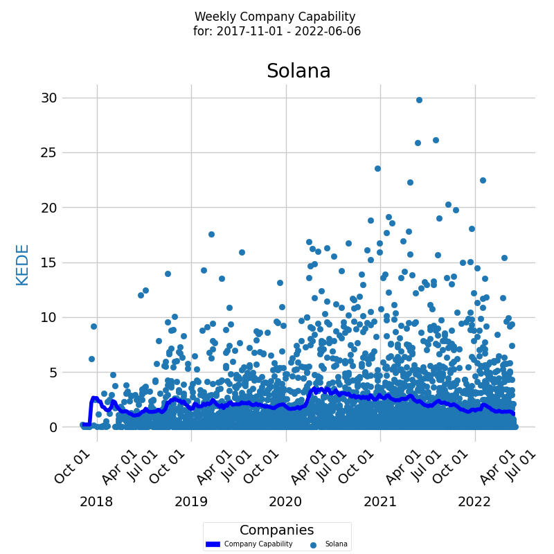
Each individual developer's aggregated Weekly KEDE is presented as a colored dot on the diagram, providing a clear visual representation of how the company's capability changes over time. The dark blue line on the diagram represents the average weekly KEDE for your developers, calculated using the Exponentially Weighted Moving Average (EWMA) method.
KEDEHub's powerful time series diagrams can be used to perform this analysis for different time periods and with different levels of granularity, such as daily KEDE values. With this information, organizations can take proactive steps to ensure that their capability remains strong and that they continue to achieve success in the industry.
Company Capability Distribution
Process capability is defined as a statistical measure of the inherent process variability of Knowledge Discovery Efficiency (KEDE), which quantifies the balance between individual capability and work complexity.
KEDEHub provides powerful histogram tools that allow for a deeper understanding of how an organization's capability levels are distributed across its developers and how they compare to the rest of the industry. By comparing the histograms of the Weekly KEDE values for the company's developers and for all other developers on KEDEHub during the selected time period, organizations can identify any patterns or trends that may be affecting their capability and take steps to improve it.
The diagram below presents a histogram of aggregated Weekly KEDE values for a selected period, with the x-axis representing the Weekly KEDE and the y-axis displaying the percentage of each particular value.
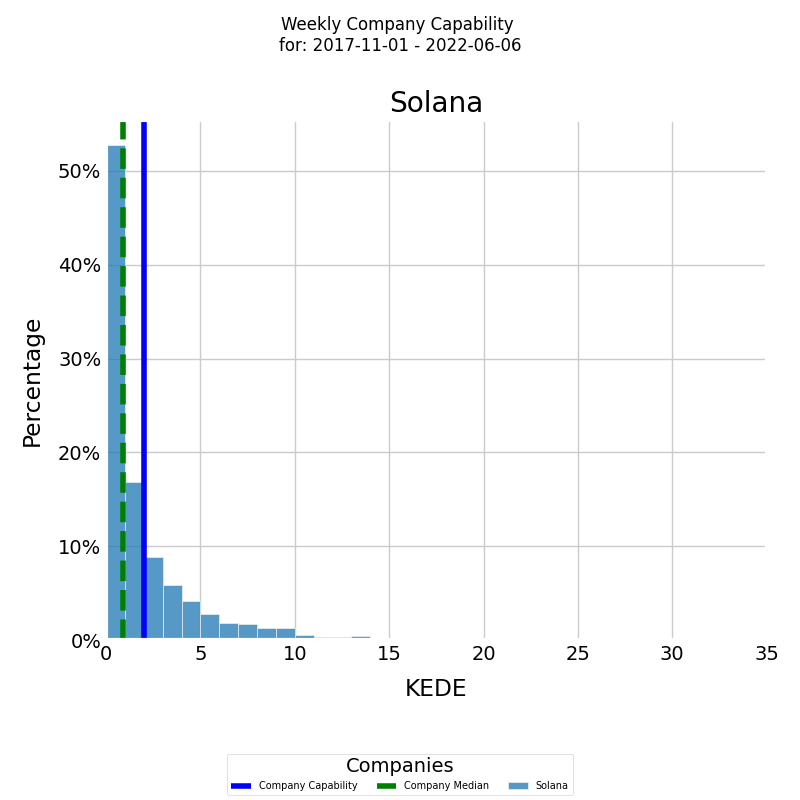
The histogram is presented in color for the company's developers, with the blue vertical line representing the average weekly KEDE for the selected period and the green vertical dashed line representing the median weekly KEDE.
KEDEHub's powerful histogram tools can be used to perform this analysis for different time periods and with different levels of granularity, such as daily KEDE values. With this information, organizations can take proactive steps to ensure that their capability remains strong and that they continue to achieve success in the industry.
Impact of Company Size on its Capability
Process capability is defined as a statistical measure of the inherent process variability of Knowledge Discovery Efficiency (KEDE), which quantifies the balance between individual capability and work complexity.
Software development projects rely on the contribution of teams of developers, who are required to collaborate and coordinate their efforts. How team size is related to the utilization of their human capital, is an important consideration for project and schedule management as well as for cost estimation. The majority of studies in empirical software engineering suggest that organizations become less productive as they grow in size. In software development there is the Brooks' law, which states that “adding more people to a late project makes it later”.
The first diagram provided by KEDEHub is a time-series that displays how an organization's capability is affected by team size over time.
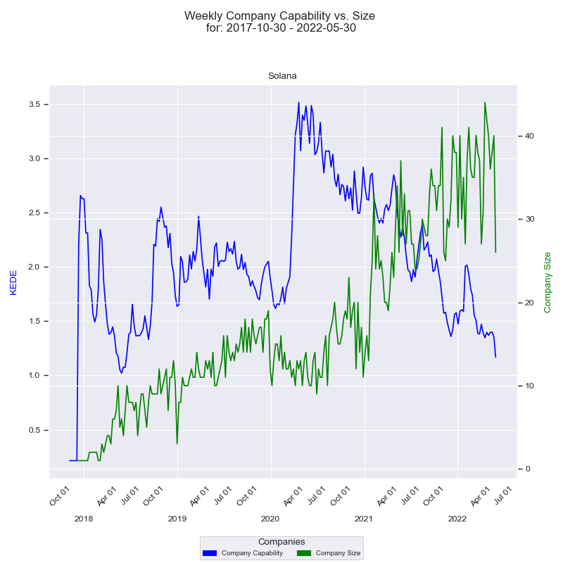
The x-axis of the diagram represents the quarter dates, while the y-axis on the left displays the capability in Weekly KEDE values. The dark blue line on the diagram represents the average Weekly KEDE for all the developers who contributed to the company's projects in a given week, calculated using EWMA. This line provides a clear visual representation of how the organization's capability changes over time.
On the right side of the diagram, the y-axis displays the size of the company, represented by the number of developers who contributed to any of the company's projects in a given week. The green line on the diagram represents how the company size changes over time, with each point on the line representing the number of developers who contributed in a given week. How the diagram is constructed is available here.
By analyzing this diagram, organizations can gain valuable insights into how their capability is impacted by team size and take proactive steps to optimize their human capital utilization. With this information, they can ensure that their projects are delivered on time, on budget, and with high quality, regardless of team size.
Distribution of Capability vs. Number of Developers
Process capability is defined as a statistical measure of the inherent process variability of Knowledge Discovery Efficiency (KEDE), which quantifies the balance between individual capability and work complexity.
KEDEHub provides a histogram to understand how the frequency distribution of company's capability changes with the number of developers over time.
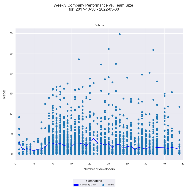
The x-axis displays the number of developers who contributed to any of the projects in a given week, while the y-axis represents the weekly KEDE values. Each individual developer's aggregated Weekly capability is presented as a light blue dot on the diagram, while the dark blue line represents the average weekly capability for all developers calculated by arithmetic mean. Analyzing this histogram provides insight into how the capability of the company is affected by the number of developers who contribute to the projects. How the diagram is constructed is available here.
Company Happiness Over Time
Happiness level for a company is calculated as follows:
- Take all developers who contributed code to any of the company's repositories during a selected time period.
- For each developer, their Happiness level is computed by aggregating Happiness levels values over all repositories they contributed to during that week.
The diagram below presents a time series of Happiness levels for the company over a given period. On the x-axis, the diagram displays the week dates, while on the y-axis, it shows the Happiness levels.
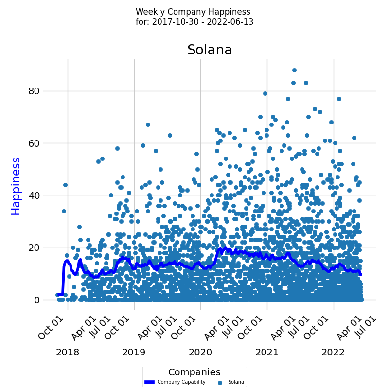
Each colored dot represents an individual developer's Happiness level, and the dark blue line represents the average Happiness level for all developers calculated by EWMA.
Distribution of Company Happiness
In addition to tracking a company's Happiness level over time, it is also useful to examine the underlying frequency distribution of its Happiness levels. A frequency distribution provides insights into the distribution of the capability values and how often each value occurs.
The diagram below displays a histogram of averaged Happiness levels for a selected period, with the x-axis representing the Happiness level and the y-axis showing the percentage of each particular value.
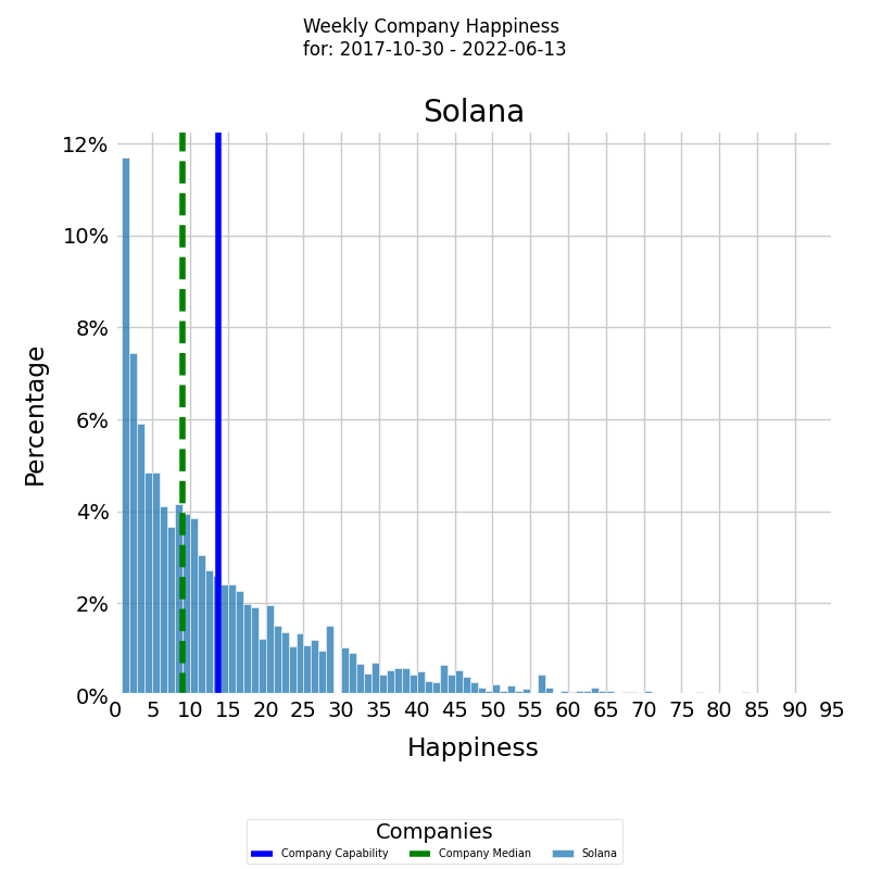
The histogram is presented in color with the blue vertical line representing the average Happiness level for the company for the selected period, calculated using arithmetic mean. The median Happiness level for the company for the selected period is presented by the green vertical dashed line.
Company Information Loss Rate Over Time
Rework level for a company is calculated as follows:
- Take all developers who contributed code to any of the company's repositories during a selected time period.
- For each developer, their waste level is computed by aggregating waste levels values over all repositories they contributed to during that week. For instance, if developer A contributed to repositories R1 and R2 during a week, and the waste level values for R1 and R2 were 2 and 3 bits lost respectively, then the developer's waste level for that company and week would be 5 bits lost.
KEDEHub provides insights into company average waste over time, allowing organizations to monitor and identify trends in their performance. The diagram below presents a time series of waste levels for your company over a given period. On the x-axis, the diagram displays the week dates, while on the y-axis, it shows the waste levels.
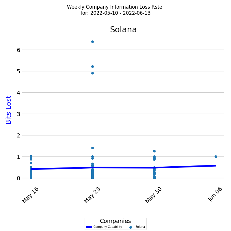
Each colored dot represents an individual developer's waste level, and the dark blue line represents the average waste level for all developers calculated by EWMA.
Distribution of Company Information Loss Rate
In addition to tracking a company's Rework level over time, it is also useful to examine the underlying frequency distribution of its waste levels. A frequency distribution provides insights into the distribution of the capability values and how often each value occurs.
The diagram below displays a histogram of averaged waste levels for a selected period, with the x-axis representing the waste level and the y-axis showing the percentage of each particular value.
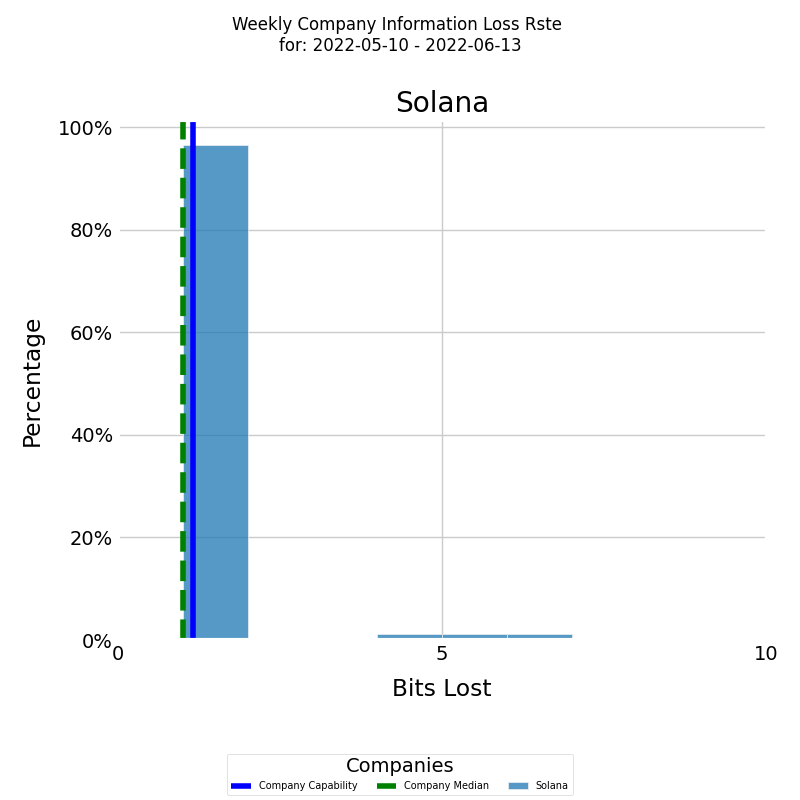
The histogram is presented in color for the company, with the blue vertical line representing the average waste level for the company for the selected period, calculated using arithmetic mean. The median waste level for the company for the selected period is presented by the green vertical dashed line.
In the histogram visualization, values have been adjusted for clarity:
- Values Above 100: Any data point greater than 100 is grouped into a single bin at the 100 mark.
This method provides a clear representation by highlighting the distribution of the majority of the data. However, it's crucial for viewers to note that for visualization purposes, extreme values (below 1 or above 100) are grouped into their respective edge bins.
Getting started


