Forecasting software development projects
A knowledge-centric approach
Overview
The Forecasting tab is part of the main menu.
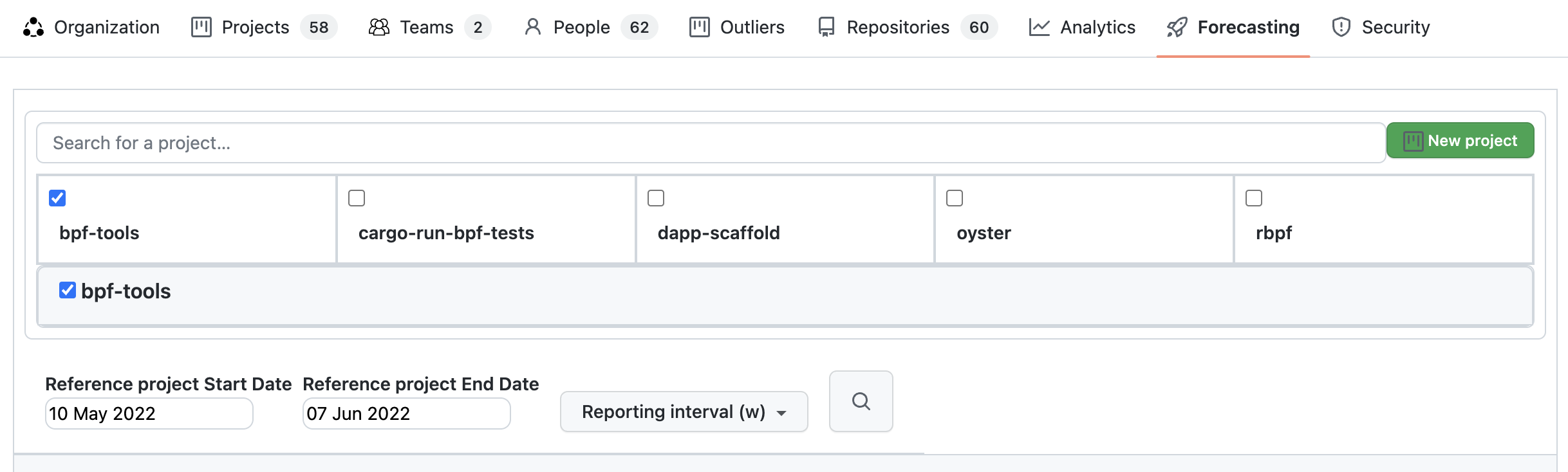
Below it is the search box for projects. You can search for your company's projects by long name. Search looks into your company's projects by long name, not project IDs (project name) and returns up to 10 results. Initially are listed the 10 company's projects most active in the last 30 days before the latest commit date for the company.
Also a new project can be created by clicking the "New project" button.
Report parameters that can be selected are:
- Reporting interval - can be daily, weekly, monthly or quarterly.
- KEDE frequency - could be daily or weekly.
- Compare - Switch on/off comparability with the rest of the world.
- Verbose - Switch on/off showing the individual data points.
- Start and end dates of the report.
Analyzing Growth of Knowledge Discovered on a Project
Knowledge discovered is the cumulative sum of missing information (or questions, in our model) over a specific time period. It signifies the total amount of information contained in a set of messages, which is derived from the sum of the information in each individual message.
Below is a diagram of the growth of knowledge discovered in bits for a real project.
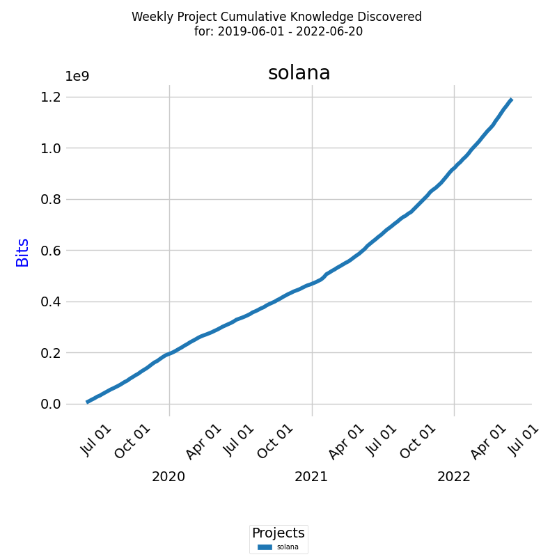
The x-axis represents the week dates, while the y-axis represents the knowledge discovered in bits of information. The line on the diagram represents the growth of knowledge discovered during the selected period.
This report is also available for Daily KEDE and for multiple projects. By running this report on multiple projects, you can compare the cumulative growth of knowledge discovered of different projects and identify patterns and trends that may affect the success of your projects.
We also need to normalize the data to allow for a more meaningful comparison across reference class projects with varying magnitudes of knowledge discovered. Comparing raw values in bits may be misleading, as differences in scale can distort the true relative performance between projects. To measure the normalized growth of knowledge discovered, we'll use the metric cumulative growth rate (CR) of knowledge discovered.
Analyzing Cumulative Growth Rate of Knowledge Discovered on a Project
The cumulative growth rate of knowledge discovered is an important metric to track the progress of a project. The line on the diagram represents the exponential cumulative growth rate for all developera for the selected period.
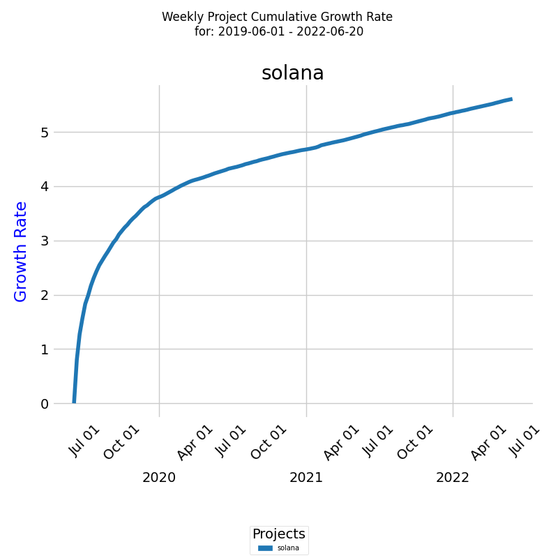
The x-axis represents the dates, while the y-axis represents the cumulative growth rate. We can see the total growth rate for the selected project and time period.
The exponential cumulative growth rate is a measure of the compound growth rate of knowledge discovered over time, which takes into account the compounding effect of growth. By analyzing the growth rate of a project over time, you can gain insight into the performance of your team and the progress of the project.
This report is also available for Daily KEDE and for multiple projects. By running this report on multiple projects, you can compare the cumulative growth rate of different projects and identify patterns and trends that may affect the success of your projects.
However, this method is subjective and may not capture all the nuances of similarity or dissimilarity, especially when comparing many curves. For a more quantitative assessment, you can use statistical distance metrics.
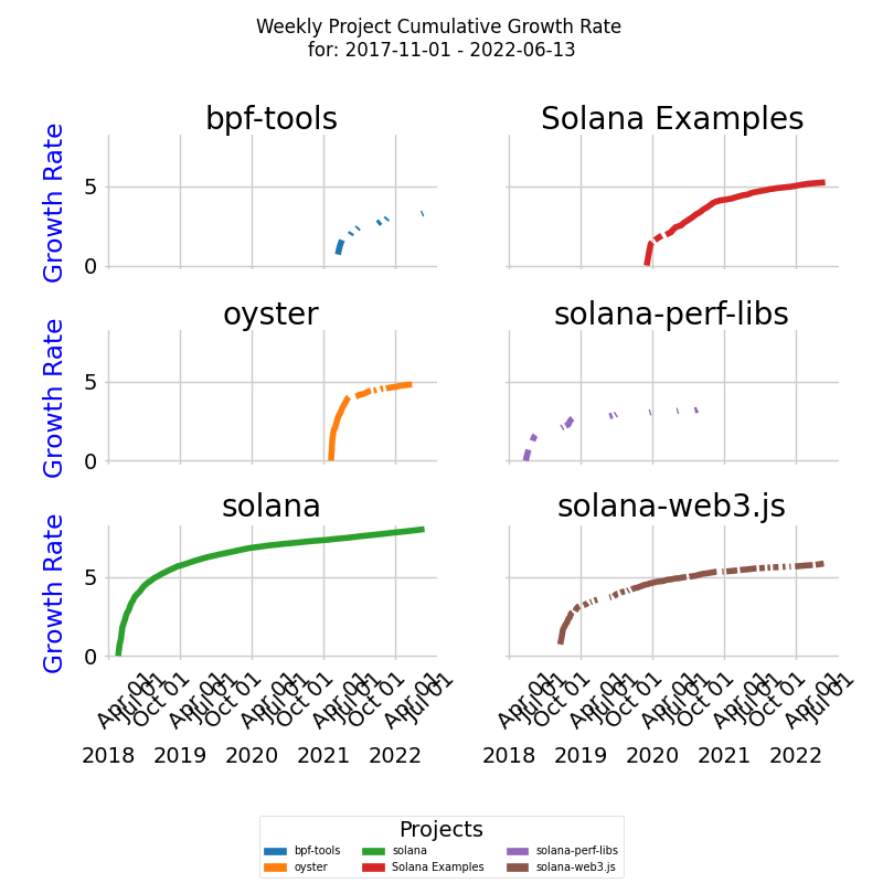
Clustering Projects by Cumulative Growth Rate of Knowledge Discovered
In order to implement Step 3 of Reference Class Forecasting (RCF), we need to compare the Cumulative growth ratea (CRT) for past projects to see they belong to the same reference class.
To compare multiple CRT curves in terms of their similarity, we use Dynamic Time Warping (DTW) to measure the similarity between them, considering their different time units.
The DTW distances between the curves are then used to perform hierarchical clustering, which groups the curves into clusters based on their similarity. Each cluster is then assigned a unique color, allowing users to easily identify which curves are closely related.
In the diagram below, we have six CRT project curves clustered into two clusters - blue and red, taking into account their different lengths in time units, and color the curves based on the clusters obtained from DTW distances.
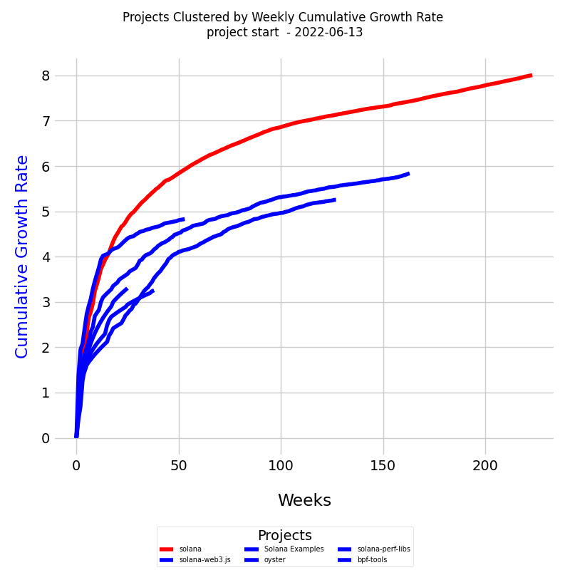
The diagram is a line plot displaying all the project curves together. The x-axis represents the number of weeks, while the y-axis represents the cumulative growth rate (CR).
Here's what you'll find in the diagram:
- Lines: Each line represents a project curve. The lines may have different lengths, reflecting the varying time units across the curves.
- Dates: Each learning curve starts at the project's inception and continues to the specified end date.
- Colors: Each cluster of similar curves is plotted in a distinct color. This color-coding helps in identifying the clusters visually.
- Legend: The legend at the bottom lists each project and indicates the cluster to which it belongs. This provides an easy reference to understand the grouping of the projects.
Usage in Analysis
This visualization can be particularly useful in understanding the growth dynamics of different projects and identifying patterns or anomalies. By clustering the curves based on their similarity, the diagram allows users to discern relationships and groupings among projects, aiding in comparative analysis and strategic decision-making.
The flexibility in handling curves of different lengths makes this approach applicable to diverse contexts, accommodating projects with different timelines.
Forecasting Project Completion Time
Forecasting inherently involves uncertainty, as it requires predictions about future events or trends. To manage this uncertainty effectively, KEDEHub utilizes a probabilistic forecasting approach, generating multiple scenarios to represent a range of potential outcomes.
The goal is to construct an array of possible future scenarios for a project, considering the uncertainty in exponential growth rates of knowledge discovery. Each scenario depicts a unique pathway in which the project's knowledge discovery could progress.
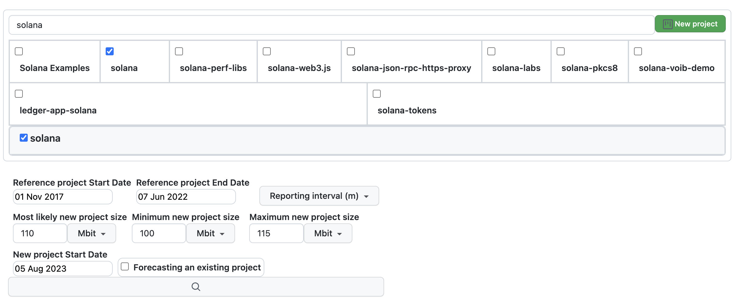
The figure above presents the forecasting screen with all available parameters:
- Project to be Forecasted:: Located at the top, you can search for the project by name.
-
Reference Project:
- Positioned to the right, searchable by name.
-
Parameters for the reference project include:
- Start date
- End date
-
New Project to be forecasted Parameters:
- Reporting interval (options include daily, weekly, monthly, or quarterly).
- Most likely project size in bits of information
- Minimum project size in bits of information
- Maximum project size in bits of information
- Target project start date
- Whether the new project is a continuation of the reference project
Once all parameters are provided, click the "Forecast" button to generate the project forecast.
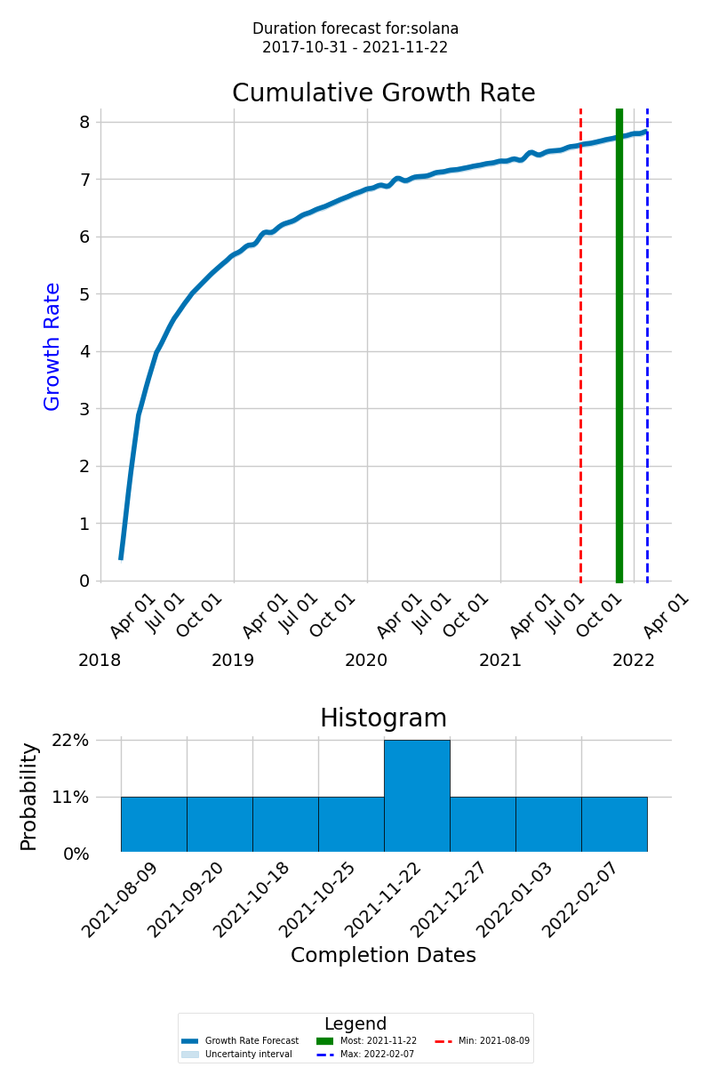
Understanding the Forecast Graph
On the forecast graph, the thick blue line represents the cumulative growth rate of the knowledge expected to be discovered for the successful delivery of the project. The x-axis displays the timeline of the new forecasted project, and the y-axis shows the cumulative growth of the knowledge to be discovered
The green line represents the most likely completion date, the dashed red line indicates the earliest possible completion date, and the dashed blue line designates the latest possible completion date. This range of outcomes helps you prepare for different eventualities and plan your project more effectively.
Histogram of Completion Dates
At the bottom of the diagram, the histogram provides a visual representation of the likely completion dates and their probabilities, allowing you to assess the overall distribution of possible completion times.
Saving a Forecast
You can modify the forecasting parameters to generate different forecasts. Once satisfied, you can save the forecast:
- Click the "Save the Forecast" button to store the current forecast in the database.
- Note: Each project can have only one forecast. Clicking the "Save the Forecast" button will replace any existing forecast with the current one.
Viewing a Saved Forecast
You can view a saved forecast by selecting a project and clicking the "Load Forecast" button.
Updating an Existing Forecast
You can update an existing forecast at any time by changing any of the forecasting parameters:
-
Changing the Start Date:
Use this option if you want to keep the forecasted learning curve and the estimated size but need to change the start date of the new project.
-
Changing the Estimated Project Size:
Use this option if you want to keep the forecasted learning curve and start date but need to change the estimated size of the new project, which will alter the forecasted completion times distribution.
-
Forecasting with a New Reference Project:
Use this option to replace the existing forecast with a new one based on a different reference project. In this case, delete the existing forecast and save the new one.
-
Extending the Current Forecast:
Use this option if you need to extend the forecasted project by adding new scope. This involves increasing the amount of knowledge to be discovered. Use the current project as a reference and forecast the new development.
Getting started


